
Milestone
EdTech platform for private schools: business process management for principals, teachers, students, and parents
Designed the interface
My contribution covers the design of the presented screens and journeys.

The challenge
Private schools lacked a unified platform — each role worked in its own chaos: teachers kept journals manually, parents had no insight into their child's performance, administrators couldn't see business processes in real time.
The task — design a platform architecture that is simultaneously convenient for four completely different users: student, parent, teacher, and principal.
These screens represent my contribution. Other parts of the live product may have been designed by the wider team.
Different roles. Different priorities.
The platform serves students, parents, teachers and school leaders. My contribution covers parent and student interfaces and teacher-dashboard pages. The overview places progress beside schedules, assignments and upcoming events.
Summary cards establish context before drilling down.
Schedules and tasks share the same workspace.
Persistent navigation connects the different sections.
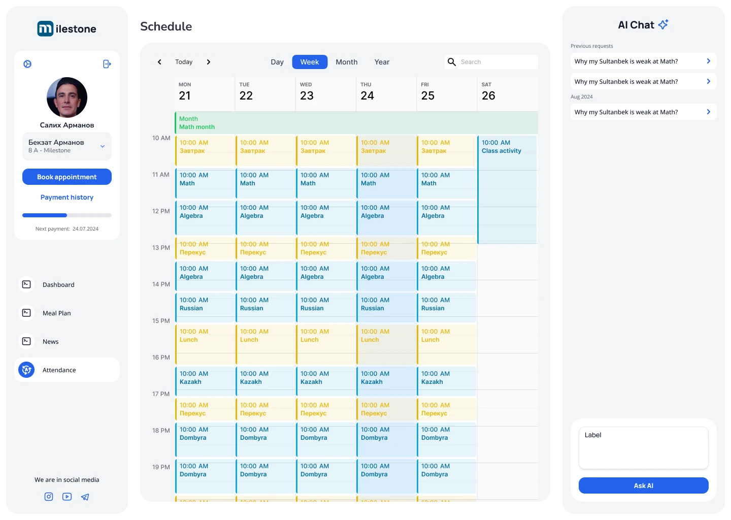
A week at a glance
Time rows and day columns structure a dense screen. Period controls and search remain above the calendar. Colored lesson blocks distinguish entries, while the side panel stays outside the calendar grid.
From a lesson to the class
The lesson page groups date, subject and class. Materials and homework sit beside those controls, with the student list below. Actions remain tied to a specific lesson.
A mobile screen with its own hierarchy
Notifications prioritize source, event and time. Background color distinguishes unread items, with filter and calendar controls near the title. Bottom navigation adapts the main sections to touch use.
More project screens8 ↗
The project’s character
The outcome
A complete UX architecture of the platform was created from research through to handoff to development.
All stages are documented: research, competitor analysis, information architecture, prototypes, UI, testing, final screens.
The platform covers four roles in one product — without compromising on convenience for any of them.