TAMYR
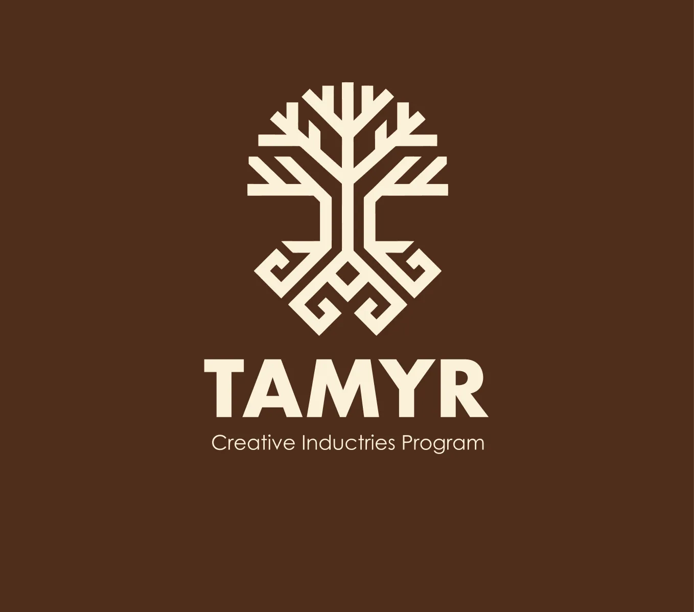
Logo for a creative industries support program — a synthesis of a tree and the Kazakh ornament 'қошқар мүйіз'
The challenge
TAMYR is a program supporting Kazakhstan's creative industries: craftspeople, ethno-designers, artists, and all who reimagine the national code.
A logo was needed that simultaneously speaks of roots and growth — of the connection of times and of movement forward.
Roots and growth in one mark
Tamyr supports the creative industries. The mark connects a tree with the қошқар мүйіз ornament: growth rests on cultural roots. A consistent rhythm of straight lines unites its upper and lower parts.
01Upper part — growth
Geometric branches extend upward and outward.
02Lower part — continuity
The ornament becomes the root system rather than a separate decoration.
03Shared geometry
Straight lines and angles connect both ideas into a single silhouette.
A restrained palette and a clear hierarchy
A brown foundation and a light mark create a calm contrast. The large Tamyr name sits below the symbol, followed by the program description. The source project identifies Futura PT and Century Gothic; the supplied logo shows the actual typographic treatment.
The identity across scales
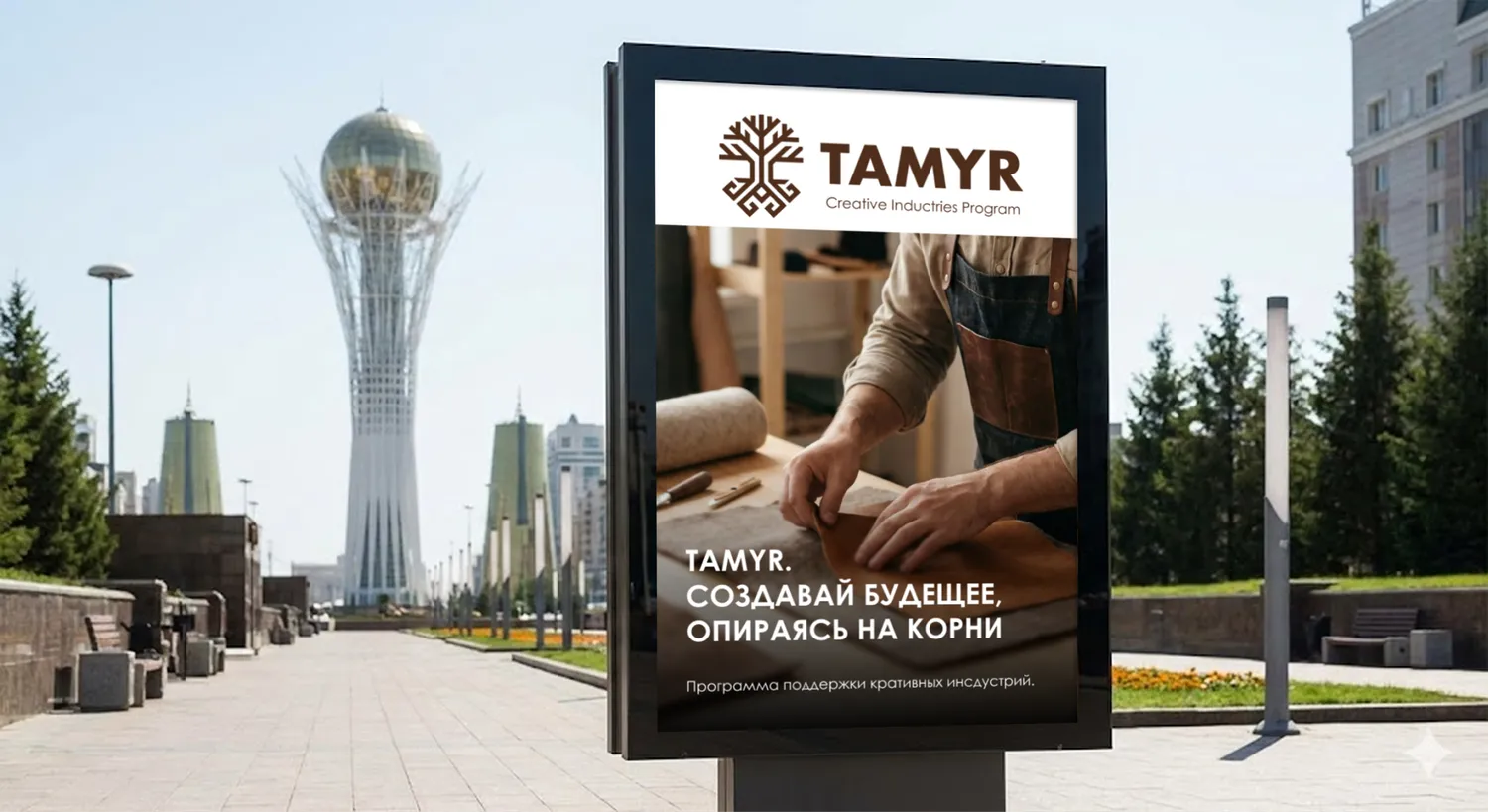
The supplied mockups show outdoor communication and a branded interior. Outdoors, the mark works with imagery and a message; inside, it acts as a standalone identifier. These are presentation applications from the project material.
The project’s character
The outcome
The logo precisely conveys the program's philosophy: 'tamyr' means root, and the symbol literally is a root from which a tree grows.
The synthesis of traditional ornament and geometric brutalism creates an identity that is recognizably Kazakh yet contemporary and not folkloric.